Well, just got back from a 121 tutorial and the Goldsmiths Fair 2013. Have had concerns about working (or thinking – in 3d).
Found the jewellery fair really inspiring, and there seemed to be a marked contrast between what some people described as ‘high-street jewellery’ and artistic pieces or pieces with individuality.
Am thinking a lot about Joseph Beuys’s work and his hares/coyotes/wolves, and perchance there was some work with hare images (more later/scrapbooked). I have been sketching hare jewellery (on the bus on the way home) of two hares looping around (an open bracelet form). However, I was thinking about my overall journey towards jewellery the most.
I remember doing a sculpture workshop and struggling to think about negative space and what I needed to remove to make shapes or, more correctly, form. I wanted to add a couple of pictures to this blog that I did a couple of weeks ago.
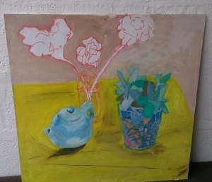
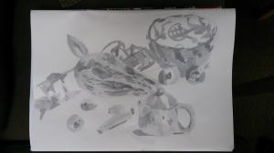
Out of these two images (left – oils, right – Chinese brush painting/watercolours), I’m really seeing some commentary about permanence in the (left) oil painting. How the teapot takes on a definite or 3d form, the plant pot ‘borrows’ some 3d qualities but the leaves are slightly unnatural in colour and the flowers are paper-like, unfinished, and one ‘goes through’ the glass. The flowers, the most transitory item, are portrayed as the most delicate.
It’s hard to paint without thinking about time passing: paint drying, an image developing over time, skills improving. Even the Chinese brush painting seemed to be about putting very thin layers on, which could be thickened over time, very similar to any watercolour style I imagine. This is all very obvious, but as a theme in itself, it is quite interesting to think about.
I wonder if this general concept of permanence is leading me towards jewellery, and by inadvertently addressing this in a painting, is becoming a signpost. Today, at the fair, I was thinking a lot about the function of painting (why display art?), and I was drawn to some jewellery that was functional: spoons, spice houses, bowls, egg holders, items that doubled up as decorative pieces when not being worn. Items that we need (and don’t need) that have been created and redesigned over centuries. Maybe reading Daniel H.Pink’s ‘Why Right-Brainers Will Rule the Future’ book has had an influence: how so many human tasks have become automated or of less worth, that creativity and abstract thinking – or design – is a central feature of the 21st century, a stark contrast to the industrial and technological ages.
This is not an either/or question for me with painting. I can’t imagine that I will ever lose the love of painting, but it is making me ask questions – how closely does surface design on jewellery reflect painting? Can you compare brushed soft metals to the brush strokes seen in paint on a canvas? How does jewellery that appears to be an artwork in itself compare to a painting?
I hope I will continue to enjoy artists who have intentionally painted in a ‘flat’ or 2d style, like Mary Fedden or John Randall Bratby. There’s probably no right or wrong answer, it’s about individual sensibility and how best an artist expresses oneself, and the medium s/he chooses or feels most comfortable working with.
It is weird though, how one of my last songs had a vague Beauty and the Beast theme – the last verse refers to the Beast walking through the gardens not being able to smell the flowers because he is so intoxicated (infatuated). The very last line of the verse: ‘I don’t care what mad hatters say, now the wolves have died’. As I think back to my opening paragraphs, and my current interest in Beuys, I am thinking that perhaps my next blog will be about recurring themes and motifs!


